PROJECT: In-Credit-Ble
This is my project portfolio for In-Credit-Ble, a product that was developed as part of our Software Engineering module, CS2103T.
In this portfolio, I will be showcasing a brief overview of my total contributions to the team project, followed by excerpts of my contributions to In-Credit-Ble’s User Guide and Developer Guide respectively.
Overview
In-Credit-Ble is a finance tracker that is tailored to help users manage their personal finances in an easy and efficient manner. In-Credit-Ble helps the user to achieve their financial objectives by helping them to keep track of their expenditure and be more aware of their spending habits. The application is designed for those who prefer to type over using their mouse, with the main mode of navigation in this application being a Command Line Interface (CLI).
Some of its key features include, but not limited to:
-
An intuitive and easy to use user interface that allows you to add new records fast.
-
Able to sort your list of recorded expenses by name, amount, date or category
-
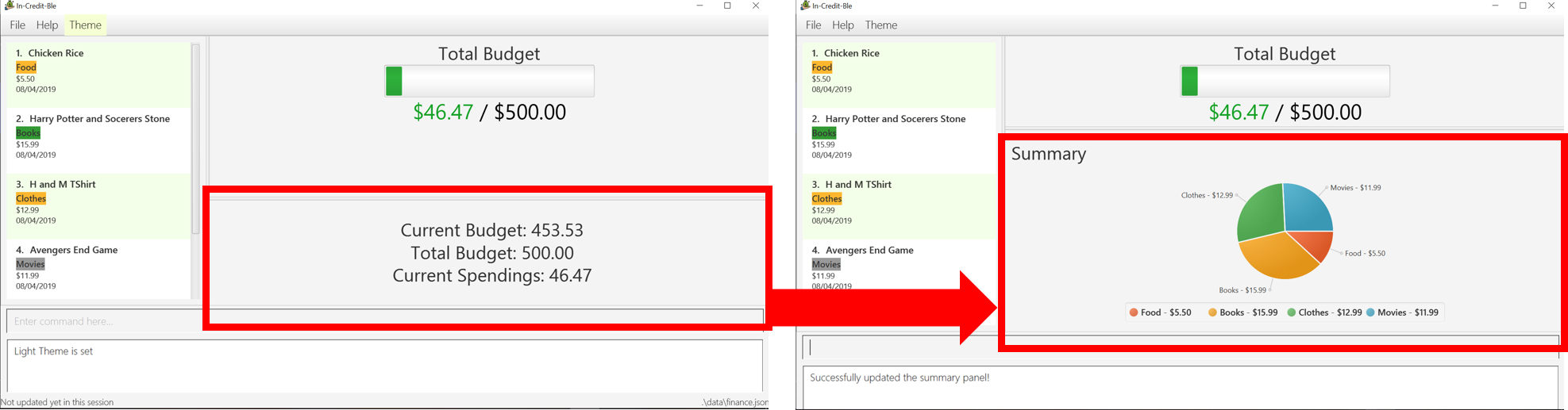
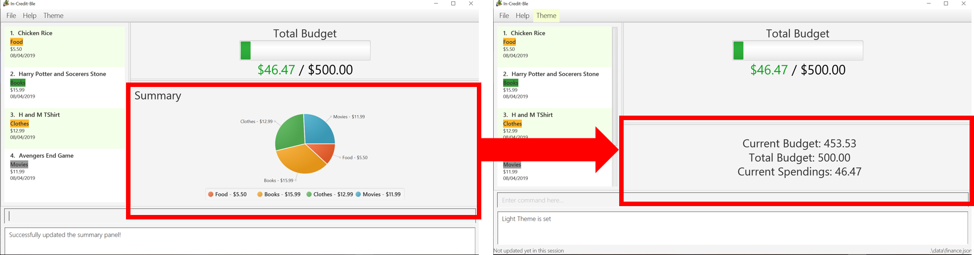
View a summary of your expenditures by their categories, illustrated as a pie chart
In-Credit-Ble was developed by four friends and I, from the National University of Singapore. We had to adapt to an existing codebase that was written in Java and develop a functional product in a short span of 13 weeks.
Summary of contributions
This section summarises my contributions towards the code, documentation, as well as other helpful contributions to the team project.
-
Major enhancement: added Summary command to represent the overview of expenses in a graphical form
-
What it does: Allows the user to view an overview of all their expenditures in a specified report period, represented as a single pie chart. Each sector represents a category, labelled with the name and amount spent in that particular category.
-
Justification: This feature improves the product significantly because a user will be able to see a quick overview of their spending in a pictorial form. his allows users to easily identify which category they spend the most on and can afford to cut down on.
-
Highlights: You can specify the report period of which expenditures should be represented in the pie chart. Else, the default report period that will be shown is the expenditures of the user in the last 7 days.
-
-
Code contributed: [Functional code]
-
Other contributions:
-
Project management:
-
Enhancements to existing features:
-
Documentation:
-
Community:
-
Tools:
-
Contributions to the User Guide
We had to update the original addressbook’s User Guide with instructions for the enhancements that we had added. The following is an excerpt from our In-Credit-Ble User Guide, showing additions that I have made for the |
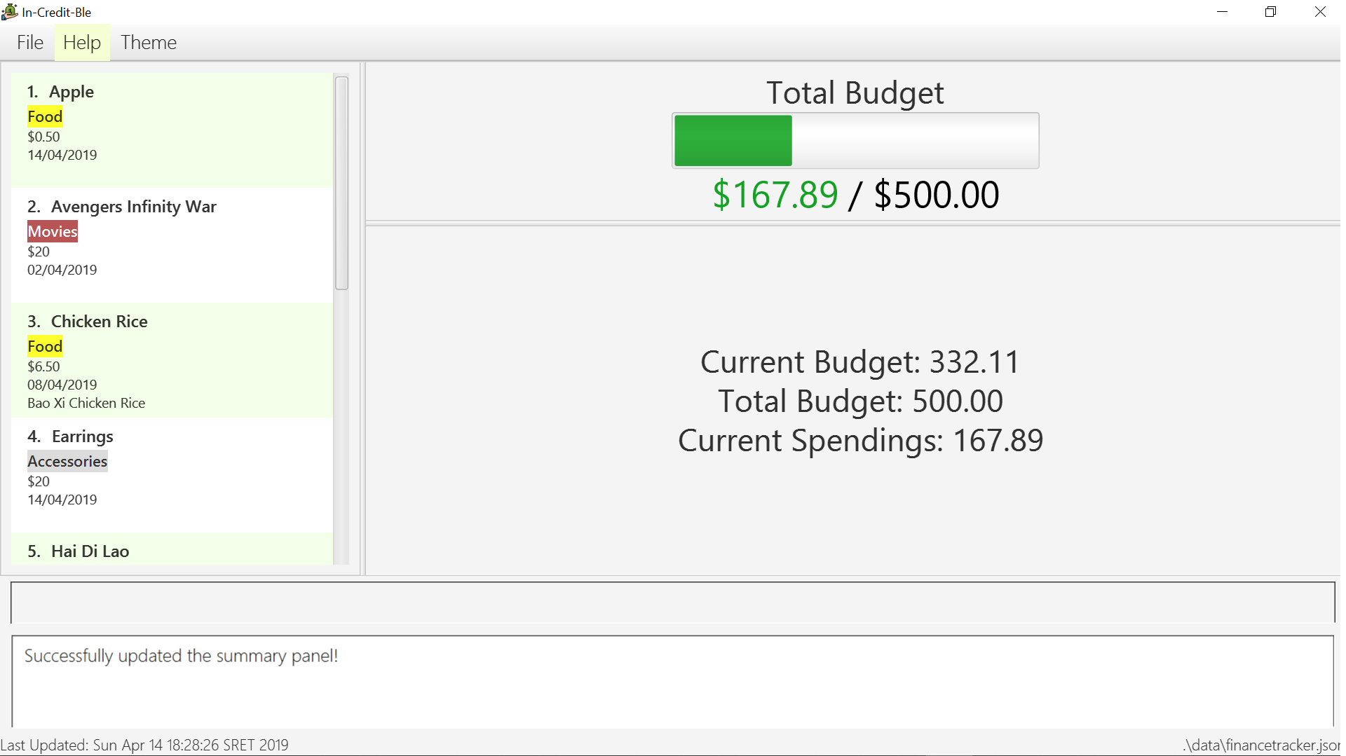
Showing summary of records: summary
, with each sector representing a category. Each sector is labelled with name and total expenditure for the category, allowing you to have a clear overview of how your spending habit is like.
By default, In-Credit-Ble will display the browser panel when you first open the application.
Entering the summary command in the command box will allow you to switch from the browser view mode to the summary view mode, as shown in the diagram below.
summary commandYou can also specify a report period by stating the number of days or months via the PERIOD_AMOUNT and PERIOD parameters.
PERIOD_AMOUNT refers to a positive integer, whereas PERIOD refers to a "day" or "month", represented as "d" and "m" respectively.
However, these parameters are optional.
To exit the summary view mode, simply type summary in the command box again.
Your screen should change back to the browser view mode as shown in the diagram below.
summary command againAlias: overview
Format: summary [ #/PERIOD_AMOUNT ] [ p/PERIOD ]
|
Upcoming Features
Login Feature [coming in v2.0]
In-Credit-Ble will implement a login feature so that your data and personal finance records will remain safe and secure. Your personal data will be encrypted and stored in your own account that can be secured with a password.
With this feature, multiple users will be able to use In-Credit-Ble on the same computer without being able to access or modify each other’s data.
Enhancements to Summary Feature [coming in v2.0]
Instead of the current pie chart, In-Credit-Ble's summary feature will display an overview of your expenditures as an Aster Plot chart instead, as shown in the diagram below.
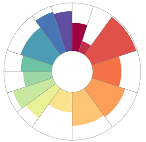
This will make it more effective in showing the user what is the remaining budget amount for each category. It also allows users to easily perceive whether their spending is within their budget for each category.
Contributions to the Developer Guide
This section contains excerpts from our In-Credit-Ble Developer Guide, showing additions that I have made for the While the whole group was involved in the discussion and formulation of our Product Scope, User Stories and Use Cases, I was the one who collated it at the end, streamlined redundancies and standardised the format and grammar. Due to page limit constraints, I will only be listing the major portion of my contribution.
To see the rest of the contributions I made to the Developer Guide, click the below link. 1) Contributions to manual testing |
Summary
The summary feature shows an overview of your previous expenditures in a pie chart. Each sector of the chart represents a category, labelled with the name and total expenditure for each category.
You can also set a report period by indicating the number of days or months. Specifying a report period is optional. If no parameters are defined, data of expenditures in the past week (ie. the last 7 days) will be displayed in the pie chart by default.
Implementation
The implementation of the Summary command can be divided into two phases – preparation and execution. Given below is an explanation of how the summary mechanism behaves at each phase.
Preparation
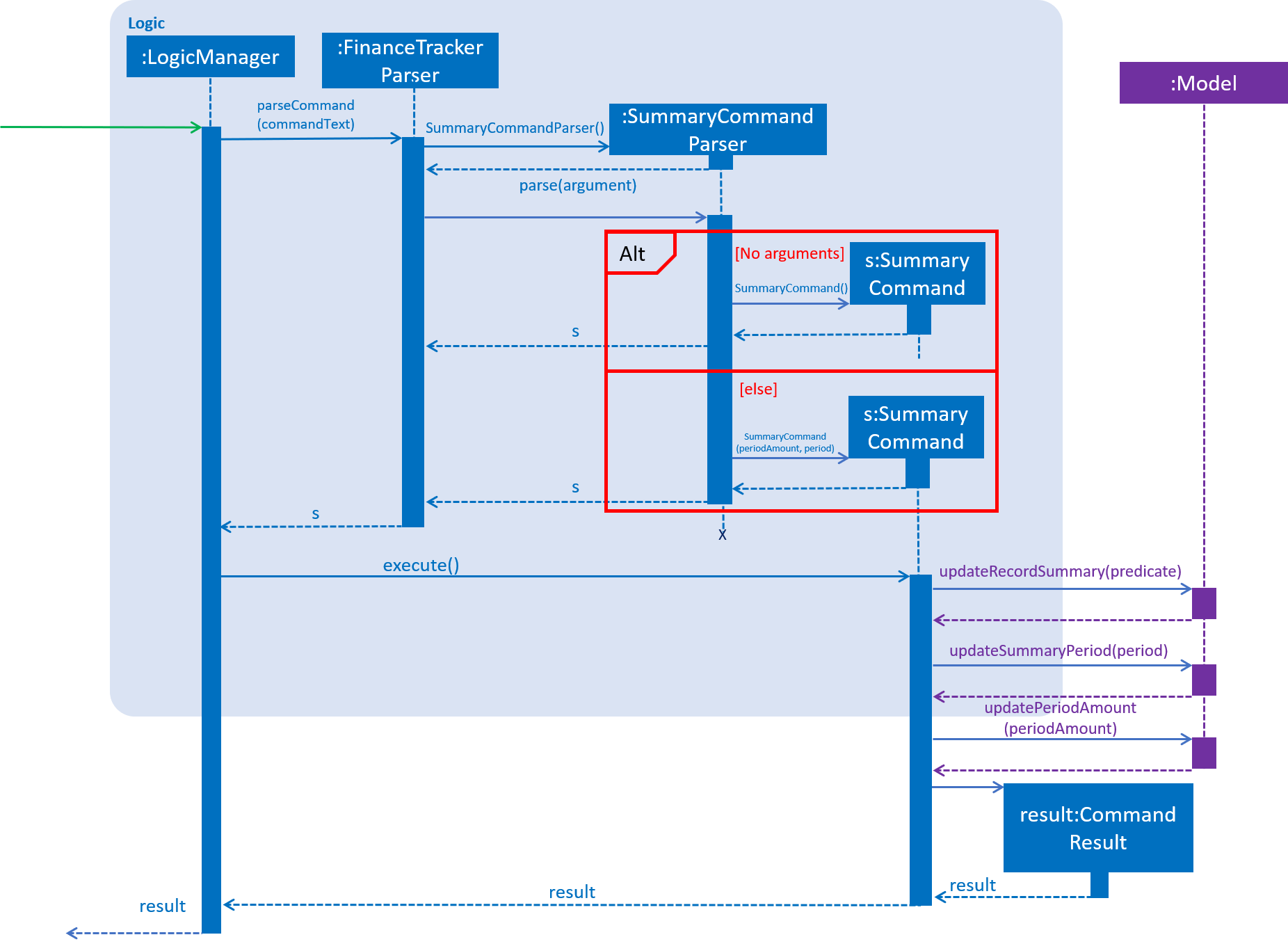
In the preparation phase, the application will parse the command. Below is the UML Sequence diagram and a step-by-step explanation of the preparation stage.
-
User first enters the command
summary #/7 p/d. This command is received byFinanceTrackerParser, which then callsSummaryCommandParser#parse()to createSummaryCommand. -
If no parameters are provided by the user,
SummaryCommand#SummaryCommand()is called to createSummaryCommandwith the default parameters ofperiodAmountas7andperiodasd. Otherwise,SummaryCommand#SummaryCommand(periodAmount, period)is called to createSummaryCommandwith the specified parameters. -
SummaryCommandthen checks if the parameters are valid. If any parameter is invalid, an exception will be thrown, and an error message will be shown to the user. Else, the parameters are stored in instance variables andSummaryCommandis returned toLogicManager. -
LogicManagerthen callsSummaryCommand#execute(), which updates the variablesRecordSummaryPredicate,summaryPeriodandperiodAmountinModelManager.
Execution
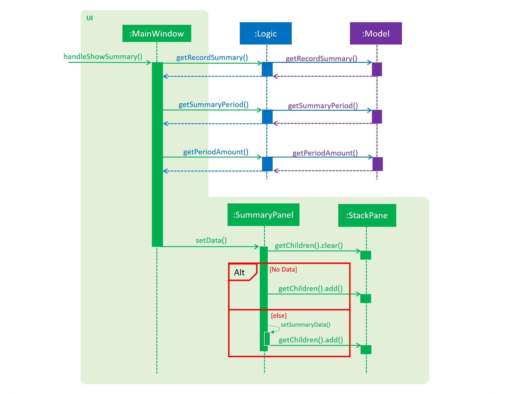
In the execution phase, the program handles ShowSummaryRequestEvent posted by SummaryCommand to retrieve the data to be displayed. The data will be rendered as a JavaFX PieChart and then displayed. Below is the UML sequence diagram and a step-by-step explanation of the execution stage.
-
The
handleShowSummarywill be handled byMainWindow#handleShowSummary(), which will callSummaryPanel#setData()and pass the data as parameters by callingLogic#getRecordSummary(),Logic#getSummaryPeriod()andLogic#getPeriodAmount(). -
Logic#getRecordSummary()gets the filtered record list by callingModel#getRecordSummary(), which returns an unmodifiableObservableList, containing only expenses in the last 7 days. -
Logic#getRecordSummary()then organises the data into aLinkedHashMap<String, Double>, where the key value pair represents category and cost. -
Logic#getSummaryPeriod()andLogic#getPeriodAmount()get their respective data by calling the method of the same name inModel. -
Once the parameters are passed into
SummaryPanel#setData(),StackPane#getChildren()#clear()is called to clear any display elements inStackPane. JavaFX’sPieChartis then used to render the summary pie chart. There are two possible scenarios which could happen:-
If the data received is empty, a
Textobject is generated andStackPane#getChildren()#add()is called, which informs the user that there are no expenditures. -
Else,
SummaryPanel#setSummaryData()will be called, which generates a Pie Chart and callsStackPane#getChildren()#add(), which adds it toStackPane. This is shown in the code snippet below:public void setSummaryData(LinkedHashMap<String, Double> summaryData) { PieChart pieChart = new PieChart(); Set<String> keySet = summaryData.keySet(); for (String s : keySet) { pieChart.getData().add(new PieChart.Data(s, summaryData.get(s))); } for (int i = 0; i < pieChart.getData().size(); i++) { PieChart.Data data = pieChart.getData().get(i); data.getNode().getStyleClass().add(getPieChartColorStyleFor(data.getName())); data.nameProperty().bind(Bindings.concat(data.getName(), " - $", String.format("%.2f", data.getPieValue()))); } pieChart.setLegendSide(Side.BOTTOM); chartArea.getChildren().add(pieChart); }
-
Design Consideration
Aspect: Representation for Summary of Expenditure
Alternative 1 (current choice): Represent summary of expenses using a pie chart.

PieChart-
Pros: Labels can act as a legend as well as there might be categories with similar colours. This will help the user to easily identify the expenditures in different categories.
-
Cons: If there are too many categories, the labels may not show up as it will clash with the other labels. The data presented may also become too cluttered as well.
Alternative 2 (planned for [v2.0]): Represent summary of expenses using an Aster Plot graph.
In v2.0 of In-Credit-Ble, the summary feature intends to use a D3.js Aster Plot graph to display the summary of expenditures instead of the current pie chart. This will help contribute to the aesthetics and user-friendliness of displaying the data in In-Credit-Ble.
Each sector of the chart represents a category. The area of each sector indicates the total budget amount allocated for a particular category, while the coloured area of the sector denotes the amount spent for that category. On mouseover of each sector, a pop-up display of the category name and amount spent for each category will be shown. The colours used for the category in the aster plot graph should also correspond to the same colour palette used for the category labels.
-
Pros: More effective in showing the user what is the remaining budget amount for each category. It also allows users to easily perceive whether their spending is within their budget for each category.
-
Cons: Difficult to implement as it requires linking to D3, a third party JavaScript library for data visualisations via HTML, SVG, and CSS.